LiteCache® Rush - WordPress Performance by Prevention
Rush: A WordPress Gatekeeper - running before "the beast" wakes up
Makes WordPress Fast - Before the First Visit
- Turns Google PageSpeed perceived speed into real speed
- Most requests never run WordPress.
- Performance improves before optimization even starts.
- Your server stops working so hard.
- Caching becomes simpler because less needs caching.
- Traffic spikes feel boring again.
- Speed comes from doing less - not from doing it faster.
No Page Cache or CDN. No Database Cache. No Optimization.
Yet 600%+ faster loading time.
Main Document Loading Time
Total Requests
Rush
without Rush
Rush
without Rush
CPU Server Load
Rush
without Rush
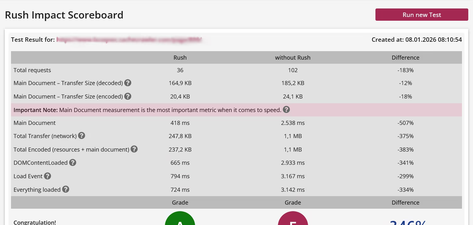
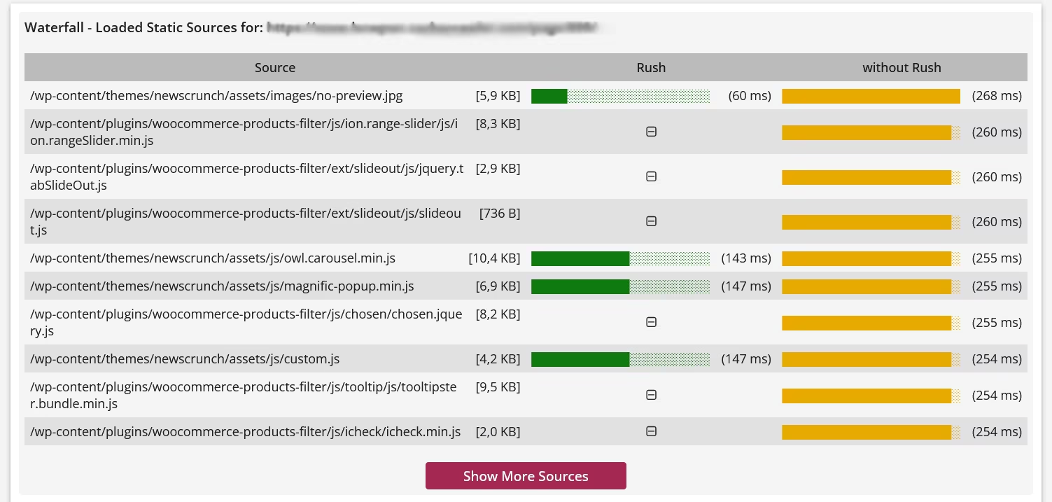
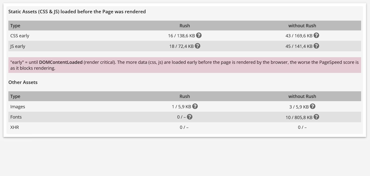
Based on Rush Scoreboard Test and Performance Web API, integrated in Rush Control Panel. Check the provided demo to see the complete test result.
What is Rush?
Rush is not the next optimization plugin. It’s not a page cache or CDN, not a database cache, not a WordPress fork, and it doesn’t modify the WordPress core in any way. Rush is what already exists, but nobody uses it!
So what is Rush?
Rush exists because WordPress does something fundamentally inefficient: it loads everything, everywhere, all the time - regardless of context. Plugins are responsible for the vast majority of WordPress’ execution time and system load. Yet WordPress itself has no native mechanism to control when plugins are actually needed.
This is the root cause of bad performance! Not an unsufficient optimization as optimization plugins cannot improve performance or loading time!
Rush acts as a Gatekeeper in front of WordPress. Before WordPress even starts, Rush decides which plugins are allowed to load - and which are not. This is something traditional optimization plugins simply cannot do. They run inside WordPress and therefore cannot control other plugins. Rush runs before WordPress. But Rush doesn't block, Rush just tells WordPress what to load and where, by context.
That’s why Rush adds virtually no overhead:
Rush introduces exactly that missing layer. Using a completely new, pre-WordPress technology, Rush controls plugin loading contextually, both in the frontend and in the backend.
The effect is immediately noticeable:
Rush doesn’t optimize WordPress. Rush prevents WordPress from doing unnecessary work. And that's why it is fast again.
Rush is administrated by the Rush Control Panel, that runs parallel to WordPress as a standalone application.
So what is Rush?
Rush exists because WordPress does something fundamentally inefficient: it loads everything, everywhere, all the time - regardless of context. Plugins are responsible for the vast majority of WordPress’ execution time and system load. Yet WordPress itself has no native mechanism to control when plugins are actually needed.
This is the root cause of bad performance! Not an unsufficient optimization as optimization plugins cannot improve performance or loading time!
Rush acts as a Gatekeeper in front of WordPress. Before WordPress even starts, Rush decides which plugins are allowed to load - and which are not. This is something traditional optimization plugins simply cannot do. They run inside WordPress and therefore cannot control other plugins. Rush runs before WordPress. But Rush doesn't block, Rush just tells WordPress what to load and where, by context.
That’s why Rush adds virtually no overhead:
- No database usage
- No runtime logic inside WordPress
- Roughly 5% of the code footprint of typical optimization plugins
A missing concept in WordPress
WordPress is flexible - but it’s context-blind. At its core, WordPress only distinguishes between posts and pages. There is no concept of contextual sources, no native way to say:"Load this plugin here - but nowhere else." Rush introduces exactly that missing layer. Using a completely new, pre-WordPress technology, Rush controls plugin loading contextually, both in the frontend and in the backend.
The effect is immediately noticeable:
- A dramatically faster frontend
- A WordPress backend that suddenly feels unexpectedly responsive
Rush doesn’t optimize WordPress. Rush prevents WordPress from doing unnecessary work. And that's why it is fast again.
Rush is administrated by the Rush Control Panel, that runs parallel to WordPress as a standalone application.
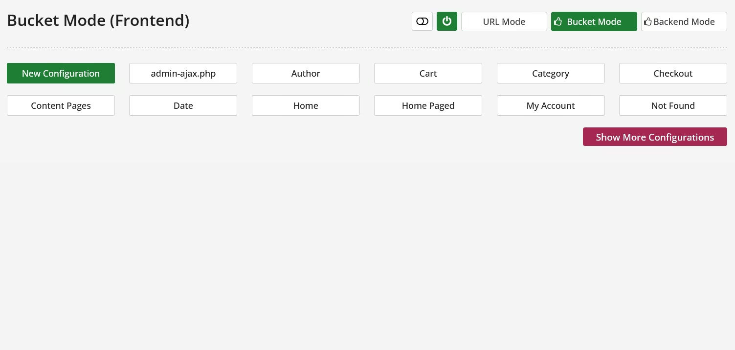
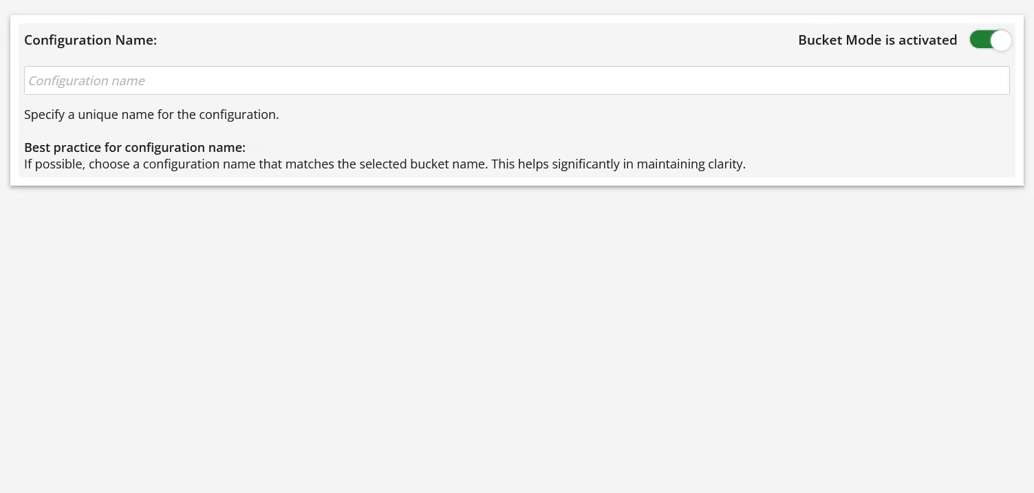
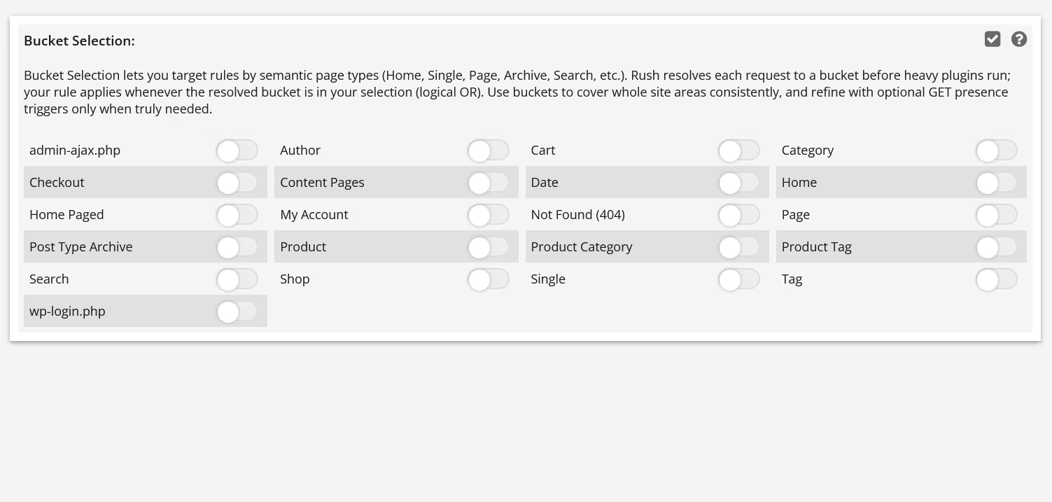
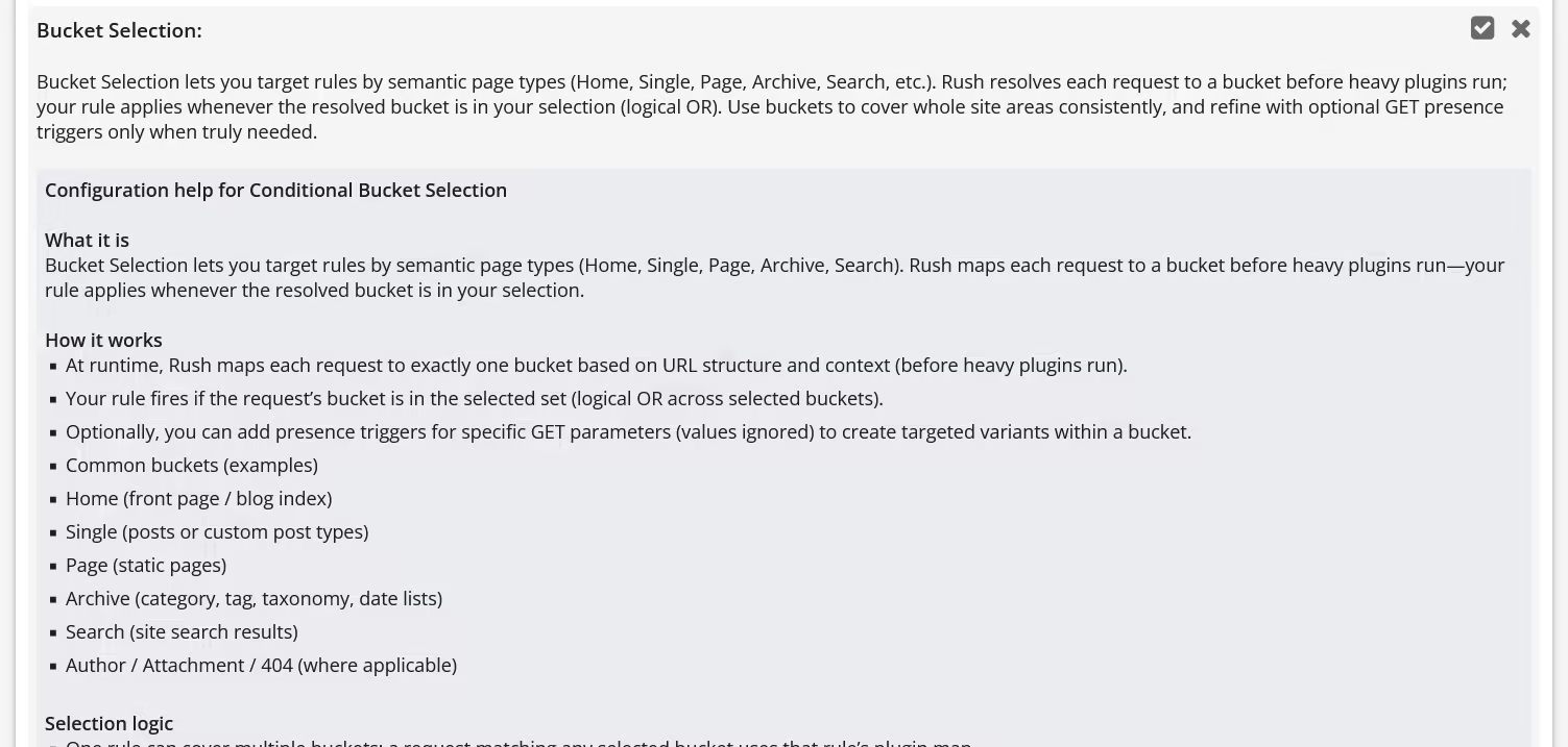
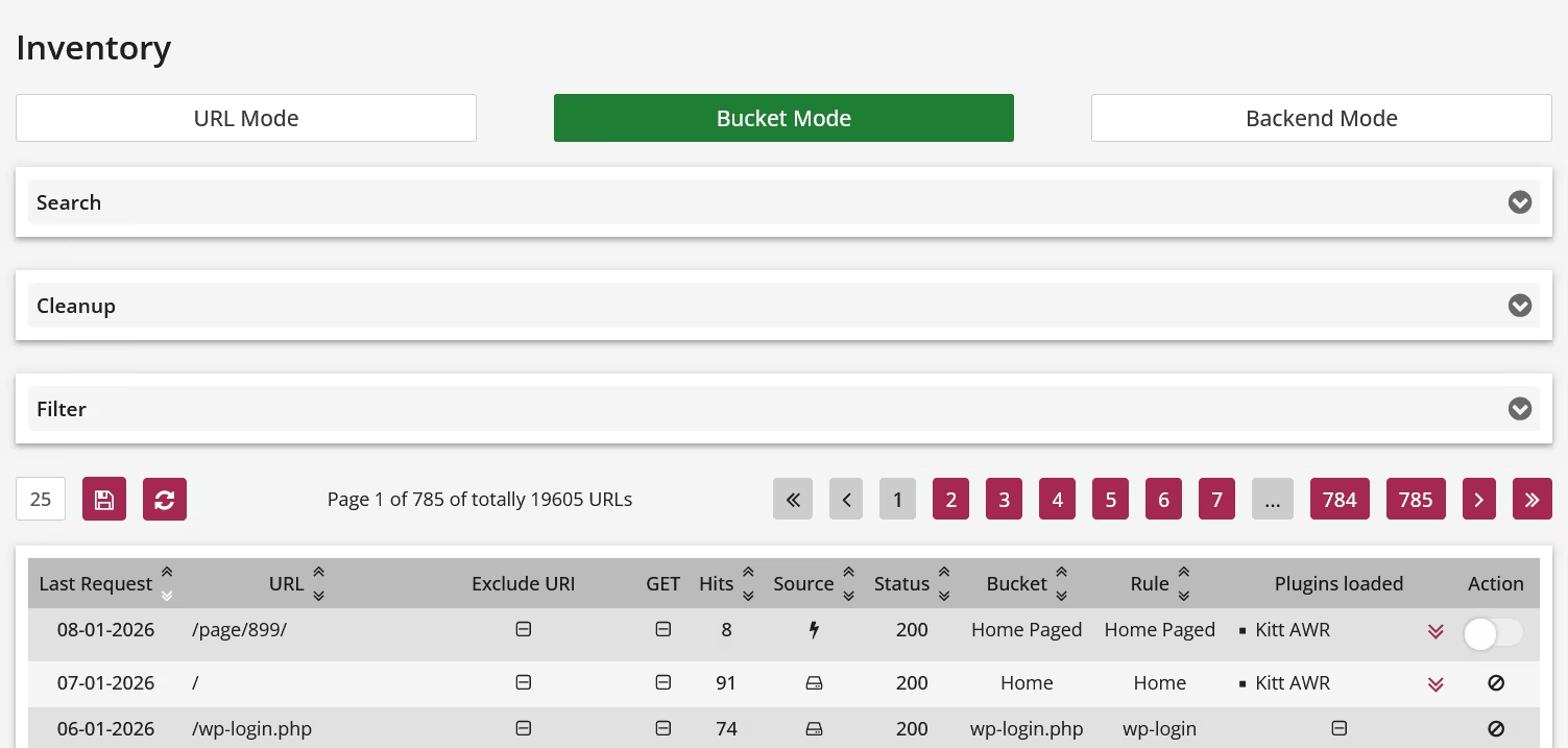
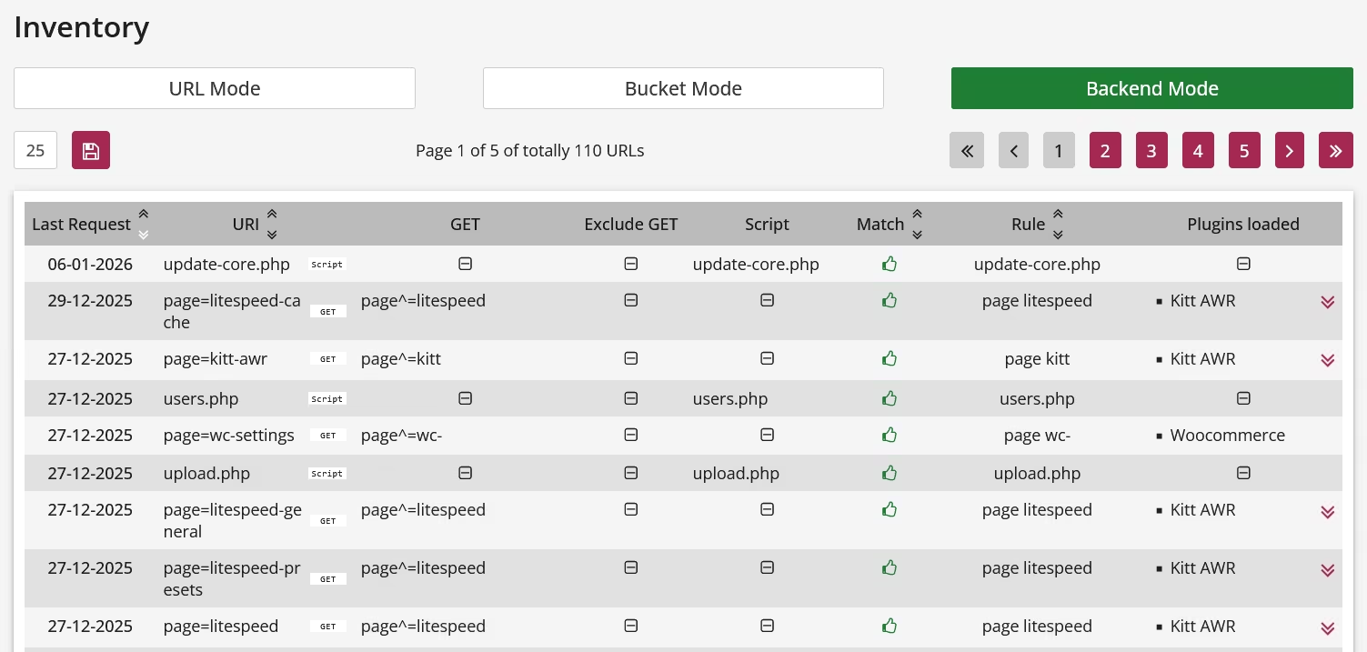
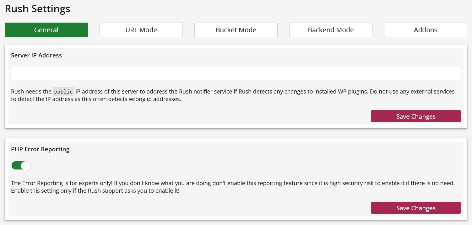
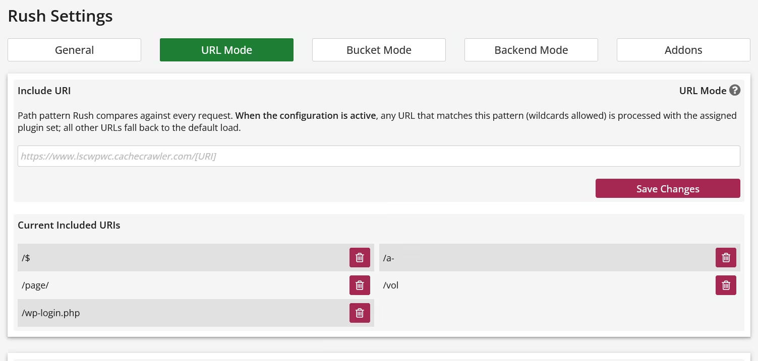
Rush Control Panel
Rush itself is headless, but Rush has to be configured and the configuration is done in Rush Control Panel that runs parallel, but independently from WordPress as a standalone application. The Control Panel offers a wide range of customizable settings, but it's not a configuration nightmare because most settings are optional, so you don't have to be an expert to configure Rush. When it comes to the necessary settings, you only need to keep four things in mind:
1. WordPress loads everything, everywhere, and all the time.
2. Plugins are responsible for the vast majority of WordPress's execution time and system load.
3. Based on point 1, all plugins are loaded everywhere and all the time.
4. Rush controls which plugin should be loaded where and only this has to be configured.
If you internalize this principle, we promise you a level of success with Rush that you can't achieve with any optimization plugin!
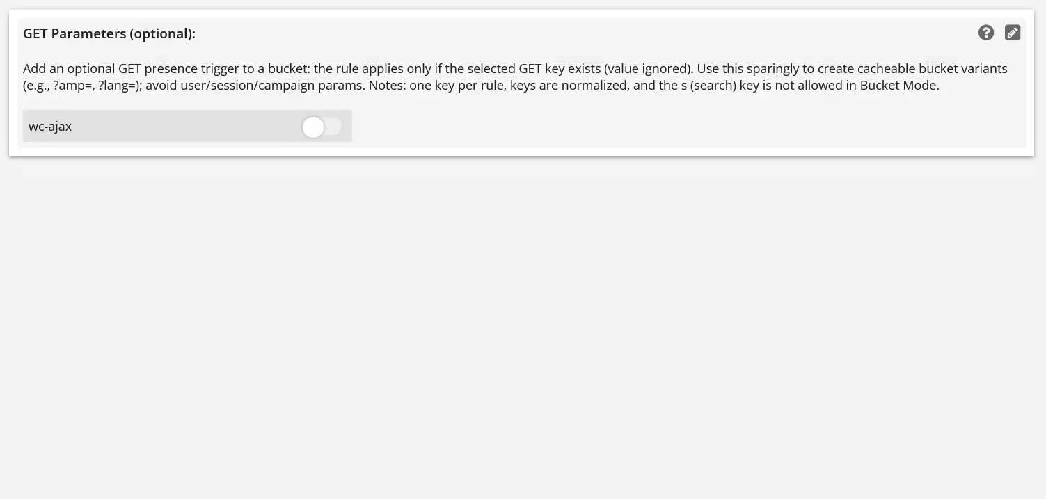
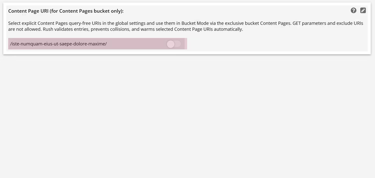
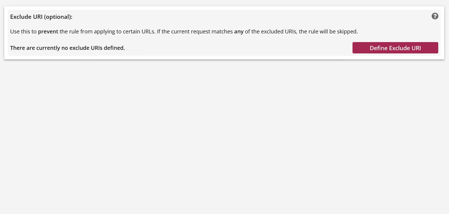
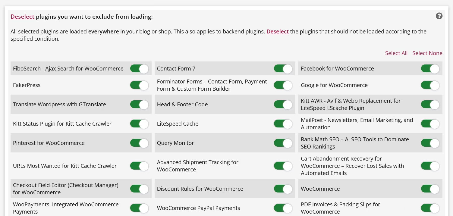
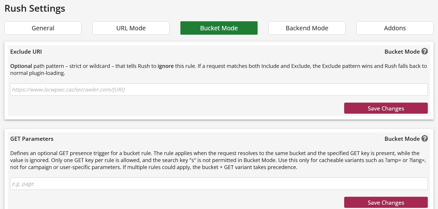
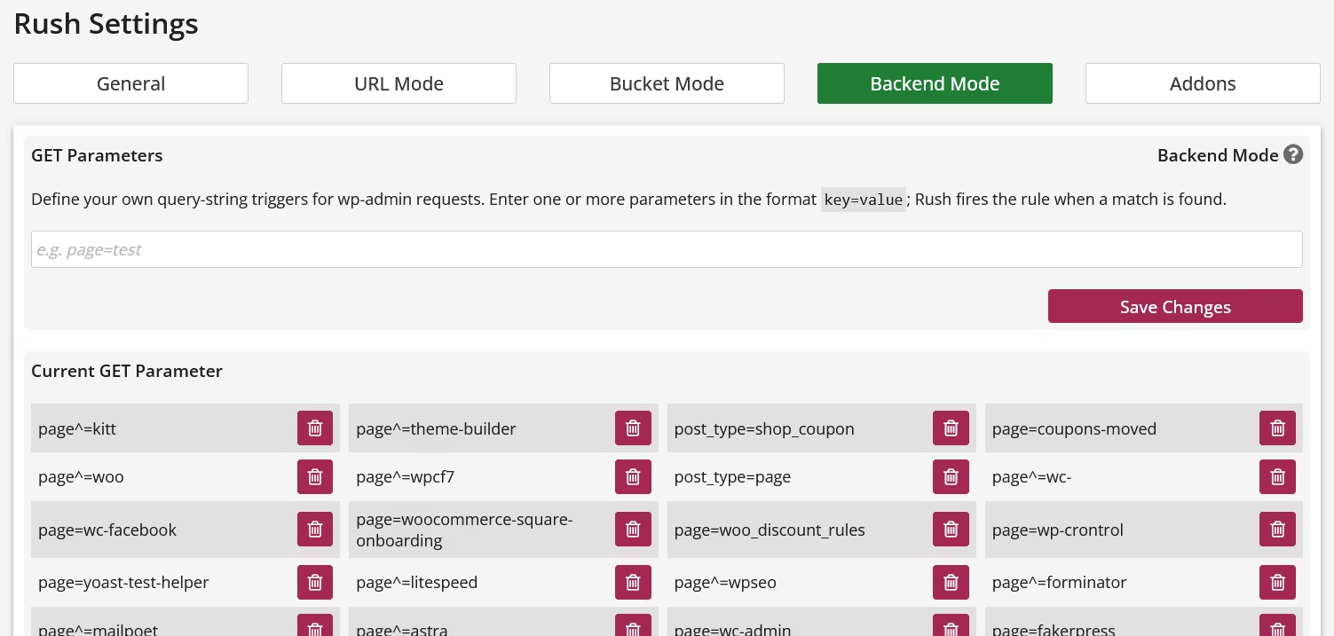
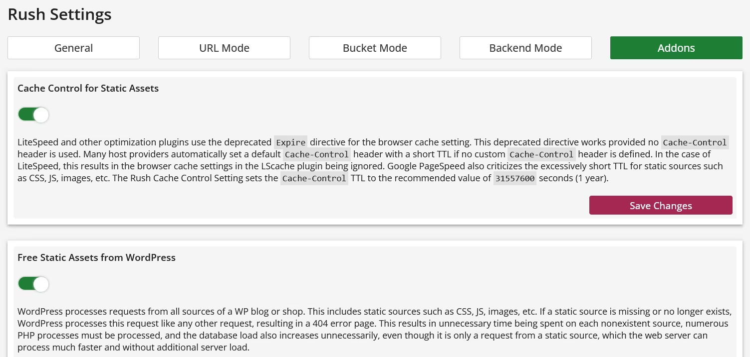
The gallery shows a selection of the most important control areas in the Rush Control Panel. Visit the provided demo for a complete overview of the Rush Control Panel.
1. WordPress loads everything, everywhere, and all the time.
2. Plugins are responsible for the vast majority of WordPress's execution time and system load.
3. Based on point 1, all plugins are loaded everywhere and all the time.
4. Rush controls which plugin should be loaded where and only this has to be configured.
If you internalize this principle, we promise you a level of success with Rush that you can't achieve with any optimization plugin!
The gallery shows a selection of the most important control areas in the Rush Control Panel. Visit the provided demo for a complete overview of the Rush Control Panel.

Demo
Want to take a closer look at Rush first? No problem.
The following demo installation allows you to fully explore the Rush Control Panel - including all relevant settings, rules, and views.
The demo is deliberately kept stable and consistent:
– no impact on production systems
– no risky experiments
– the environment is regularly reset
Login:
URL: https://www.wp.cachecrawler.com/rush-88f62301/
Username: Demo
Password: Demo
Note: The demo is meant for orientation, not for show.
Rush reveals its real value when used with a real WordPress installation.
Cache Warmup (LiteSpeed only)
Rush doesn't differentiate between web servers and is therefore compatible with both Apache and the LiteSpeed web server. However, there are differences in cache warm-up performance with the LiteSpeed Cache plugin for WordPress. While Rush fully supports the cache warm-up crawler integrated into the LiteSpeed Cache plugin, it doesn't benefit from Rush's own performance capabilities.
The Kitt Cache Crawler is a cache warm-up crawler specifically designed for LiteSpeed and WordPress and other known CMS. This makes it more powerful, intelligent, and, most importantly, faster than the built-in crawler. Furthermore, the Kitt Cache Crawler is optimized for Rush, resulting in significantly shorter crawl times.
Less crawl time means less strain on your server during warmup. After all, warmup means your server is impacted during the process and can lead to premature page crashes.
If you want maximum cache warm-up speed, The Kitt Cache Crawler for LiteSpeed is the right choice.
Requirements
Rush requires a hosting setup that meets a few technical requirements.
No need to verify anything manually - just install the provided Requirement Tester & Install Helper plugin and run the check inside WordPress.
No need to verify anything manually - just install the provided Requirement Tester & Install Helper plugin and run the check inside WordPress.
Download & Installation
Rush is installed via the provided Install Helper plugin.
Simply download the helper, install it in WordPress, and follow the guided setup.
That’s it.
Simply download the helper, install it in WordPress, and follow the guided setup.
That’s it.
Download Rush Requirement Tester & Install Helper Plugin for WordPress
Pricing
€0
Everything starts at 0 Euro.
Rush offers a highly flexible, cost-effective, and runtime-based licensing and pricing model. License management and purchase are handled within the built-in License Store of the Rush Control Panel, ensuring that no private or sensitive data is stored externally. To guarantee security and privacy, no external license validation is performed.
30 days of testing
Rush can be tested for 30 days without any restrictions and any costs. Just install Rush and test it for 30 days! If you don't like it, remove it. There is no auto-Renewal!
Rush offers a highly flexible, cost-effective, and runtime-based licensing and pricing model. License management and purchase are handled within the built-in License Store of the Rush Control Panel, ensuring that no private or sensitive data is stored externally. To guarantee security and privacy, no external license validation is performed.
- 365 Days 1st Level Support within 24h
- Updates and Support for free
- 1 License is valid for 1 Domain
30 days of testing
Rush can be tested for 30 days without any restrictions and any costs. Just install Rush and test it for 30 days! If you don't like it, remove it. There is no auto-Renewal!
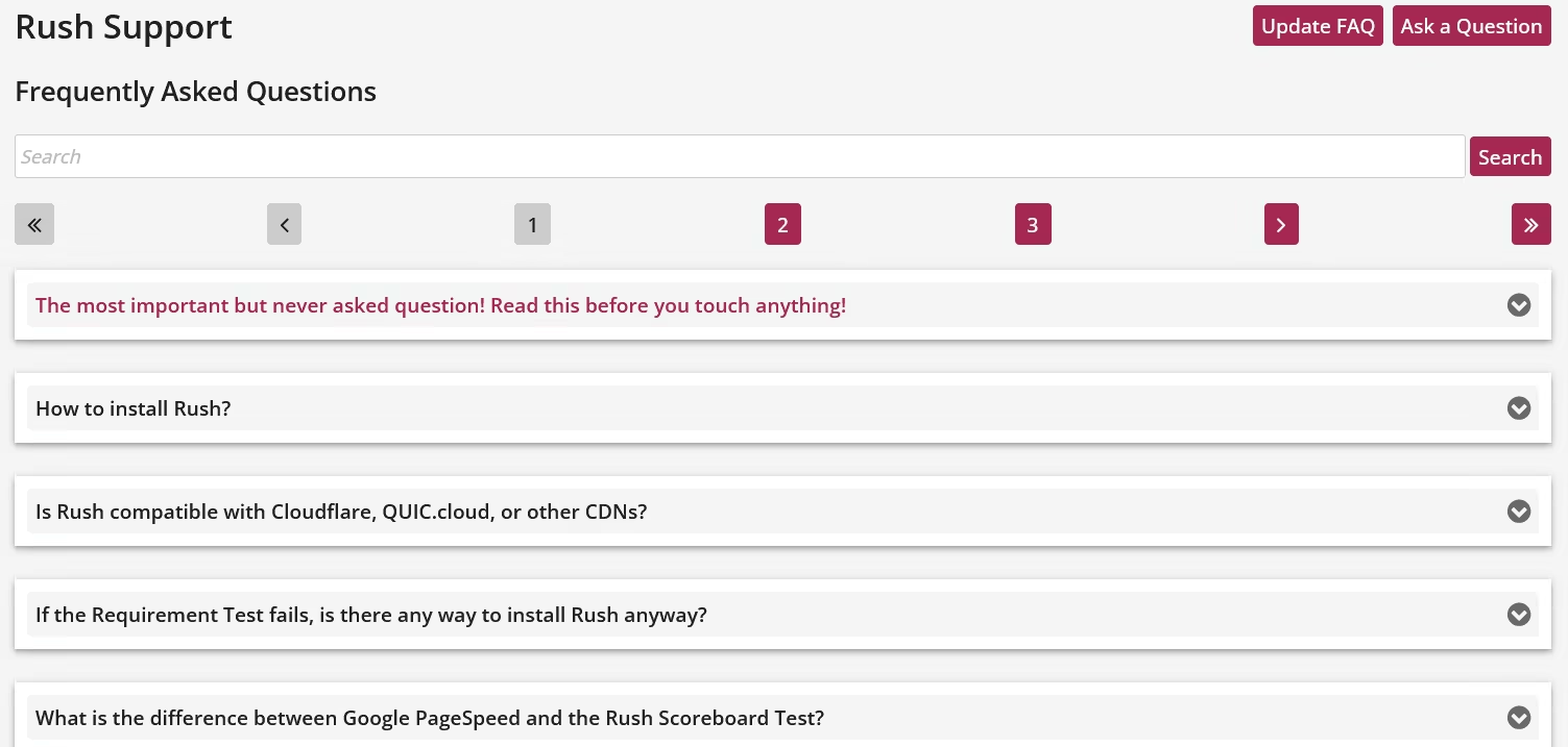
FAQ
What is Rush?
Rush is a plugin-loading controller for WordPress. It does not modify WordPress core, change any WP functions, or replace parts of the system. Rush simply decides which plugins should load for a given request — and prevents the rest from running.
WordPress loads every active plugin on every request, even when most of them are not needed. Rush intercepts the bootstrap before WordPress runs and provides a minimal, demand-based plugin set. The WordPress core remains untouched — Rush is not a fork, override or patch. Themes, builders and WP internals behave exactly as they were designed. Rush improves performance by reducing unnecessary plugin execution, not by altering WordPress itself.Who benefits from Rush — and who does not?
Sites affected by WordPress' all-or-nothing loading model benefit from Rush. Sites that are not affected do not.
WordPress loads all active plugins on every request — everywhere, all the time. Rush is beneficial where this behavior causes unnecessary resource usage.
WordPress follows a global loading model: once a plugin is activated, it is loaded on every request, regardless of context. Frontend requests load backend-only plugins, admin helpers load on public pages, and features are initialized even when they are not needed.
This behavior is not selective, not contextual, and not resource-aware. As a result, plugin-heavy installations waste CPU time, memory, and PHP execution on every request.
Rush addresses this exact problem. It selectively controls which plugins are allowed to load for a given request context, preventing unnecessary plugin execution before WordPress fully boots. This makes Rush particularly effective on sites with many plugins, complex setups, or mixed frontend/backend functionality.
Sites that benefit from Rush:- Plugin-heavy WordPress installations
- Sites where PHP execution time and server load matter
- Projects where frontend and backend functionality are clearly separated
- Very small sites with only a few essential plugins
Is Rush a page cache?
No. Rush does not cache pages. It controls which WordPress plugins are loaded before WordPress executes, reducing processing overhead at the source.A page cache stores and serves pre-generated HTML output. Rush does something fundamentally different: it intervenes before the WordPress bootstrap and selectively prevents unnecessary plugins from loading at all.This means Rush does not replace a page cache, does not duplicate its functionality, and does not compete with caching plugins or CDNs. Instead, it complements them by reducing PHP execution time, memory usage, and plugin overhead before any caching layer becomes relevant.Do you offer an installation service?
Yes. But you won't need any external help. If you know how to install a WordPress plugin, then you already know everything how to install Rush. Just download the Install Helper Plugin, install it in WordPress and follow the setup guide.Can Rush be tested before buying a license?
Yes. Rush can be tested for 30 days without any restrictions. This trial period is free!What is the difference between Google PageSpeed and the Rush Scoreboard Test?
At first glance, Google PageSpeed and the Rush Scoreboard Test may appear similar. Both rely on the browser's Performance API, and both aim to describe how fast a website feels. However, they measure very different phases of the request lifecycle.
Google PageSpeed is a rendering-centric test.
It focuses on how long it takes for a page to be visually painted after all required resources have already been delivered to the browser.Metrics like FCP and LCP describe when content becomes visible, not how long the server needed to generate or deliver the page.
In other words, PageSpeed evaluates display timing, not actual loading or execution time.
Heavy PHP processing, database queries, or excessive plugin execution can remain invisible to PageSpeed — as long as the final HTML and assets reach the browser in time for painting.
The Rush Scoreboard Test, by contrast, is execution-centric.
It measures what happens before painting can even begin:
server response time, PHP execution cost, WordPress bootstrap overhead, and the real workload caused by plugins and themes.
In short:- PageSpeed asks:
"How long does it take until the browser can paint meaningful content AFTER all assets (css,js, ...) are loaded?" - Rush Scoreboard asks:
"How much work does the server perform to make painting possible?"
That distinction is crucial.
PageSpeed can report excellent results even when the server does far more work than necessary.
Rush exposes this hidden cost — because it measures performance where it actually starts: on the server.
Both tools are valuable.
But they answer different questions:- PageSpeed explains how fast a page is painted.
- Rush explains why it is fast — or slow — before painting ever occurs.
- PageSpeed asks:
If the Requirement Test fails, is there any way to install Rush anyway?
No. There is no way to bypass the requirements.
There is no override, no hidden switch, and no "I know what I'm doing" option.
Rush intervenes very early and very deeply in the request lifecycle.
If even one requirement is not met, the result can be unstable behavior, incorrect test results, or system breakage.
The Requirement Test is therefore not a formality, but a hard technical safety barrier — for your system and for reliable support.
All requirements must be met. Always. No exceptions.Is Rush compatible with Cloudflare, QUIC.cloud, or other CDNs?
Yes. But not when a CDN Page Cache is used for the main document.
Rush is fully compatible with CDNs as long as the CDN does not cache the HTML document itself. Static assets are not affected.
Rush operates directly on the server-side delivery of the main document (HTML).
If a CDN additionally applies a Page Cache to the HTML, Rush can no longer control or influence the request flow.
This limitation applies only to the main document.
Static assets such as .css, .js, images, fonts, and videos can be delivered via CDN without any restrictions — and are explicitly recommended.How to install Rush?
LiteCache Rush is easy to install, but it is important to know, that Rush is not a WordPress plugin. Only the installation of Rush is done by the Rush install helper plugin. Rush is not a WordPress Plugin! Rush is a gatekeeper that runs parallel and in front of WordPress, but doesn't cause extra load to work. It reduces the load and speed's up the (real) load speed. You do not have to be an expert or a technical to install Rush. Just download the install helper plugin at cachecrawler.com, install it like any other WP plugin and run the requirement test first. If the requirement test is successful, just press the install button.
That's it! The install helper plugin is automatically removed if the installation is successful.Did Rush break my plugin?
No. Rush does not modify plugin code. It only controls whether a plugin is loaded for a given request — so issues typically come from a plugin being needed in a context where it is currently not allowed to load.
Rush does not change WordPress core, does not patch plugins, and does not rewrite plugin logic. What Rush does is decide — based on your configuration — which plugins are loaded for a specific request context.
If a plugin "stops working," it usually means one of these is true:- The plugin is not being loaded where it is actually required.
Example: a "backend" plugin also injects frontend assets, provides shortcodes, handles AJAX, REST endpoints, webhooks, or scheduled tasks. - The plugin relies on global side effects.
Some plugins assume they will always run (because WordPress normally loads everything everywhere). Rush can expose that assumption. - You are testing in a special context.
Admin requests, admin-ajax, REST API, wp-cron, or login flows may require different allowances than regular frontend page views.
What to do:- Temporarily disable Rush for a test to confirm causality.
- If confirmed: adjust the Rush configuration so the plugin is allowed in the context where it is needed.
In short:
Rush never "breaks" a plugin — it prevents unnecessary loading, and sometimes a plugin turns out not to be as "unnecessary" as it seemed.- The plugin is not being loaded where it is actually required.
Will Rush improve my PageSpeed score?
No. Rush improves server performance, not browser cosmetics. PageSpeed measures visual behavior, not backend workload.
PageSpeed evaluates what happens after the HTML is already delivered. Rush eliminates unnecessary PHP/MySQL work before the page is generated. Both operate in different worlds of the request lifecycle. A high score doesn’t mean a fast server — and vice versa. Use Rush for real performance, not for green numbers.Is Rush a WordPress plugin?
No. A plugin loads too late; Rush must act before WordPress wakes up. That’s why it runs as a controlled MU-bootstrap.
WordPress plugins load only after WP is fully initialized. At that point, the damage (full bootstrap) is already done. Rush controls the environment pre-WP to prevent unnecessary loading. This is architectural, not decorative. If Rush were a plugin, it would defeat its own purpose.Can Rush speed up Plugin X, Y or Z?
No. Rush speeds up WordPress itself by preventing plugins from running unnecessarily. Plugins become "lighter" simply because they run less often.
Rush doesn’t optimize plugin code. It removes unnecessary plugin executions from the request flow. Less work = faster server, regardless of plugin quality. Your site stays functional, but with a fraction of the load. This is structural performance, not per-plugin tuning.Do I have to tune or optimize anything in Rush?
No. Rush is not an optimizer; it’s a workload controller. It removes what you don’t need instead of tweaking what you do need.
Optimizers adjust things that still get executed. Rush’s core idea is eliminating unnecessary execution entirely. The fastest code is the code that never runs. Configurations are optional helpers, not mandatory tools. The default behavior already delivers the main benefit.Does Rush work with my page-cache plugin (LiteSpeed, WP Rocket, …)?
Yes. Rush and page-cache plugins complement each other perfectly. Rush makes the server faster before the cache even steps in.
Page-cache plugins operate after WordPress generates the first response. Rush operates before WordPress starts generating anything. This eliminates CPU pressure and makes cache hits cheaper. There is no conflict — only synergy. Caching + workload control = stable high performance.Will Rush affect my theme or page builder?
No. Themes and builders run normally but under less server load. Rush doesn’t modify frontend output.
Themes and builders execute only when needed. Rush ensures backend load is minimized before they run. Frontend design remains untouched. Performance improves because unnecessary backend work disappears. Your UX stays identical — the server effort does not.Do I have to update Rush settings when I install new plugins?
Yes. If you want the new plugin to run inside an existing Rush rule. New plugins appear in the GUI instantly, but they are not added to existing configurations automatically.
Rush freezes each rule based on the plugins that were active at the moment of configuration. Installing a new plugin does not retroactively change existing rules. The plugin will only run where you explicitly include it. This avoids unexpected behavior and keeps Rush predictable. If a new plugin should apply to existing routes, you must update those rules manually.Can Rush break URLs or block parts of my site?
No. Rush only blocks unnecessary execution paths, not legitimate pages. All essential WordPress routes remain untouched.
Rush understands WordPress’ core routes (login, admin, REST, etc.). Unknown or irrelevant runtime paths are controlled, not removed. Fallback logic prevents accidental blocking. You always retain full functionality. Only wasteful bootstrapping is filtered out.Does Rush work with WooCommerce?
Yes. Rush keeps WooCommerce active where required and inactive elsewhere. This reduces overhead on non-commerce pages.
WooCommerce loads a lot of code globally. Rush restricts Woo’s bootstrap to real Woo contexts. Cart, checkout, account pages stay fully functional. Blog pages, static pages, and marketing pages stay lightweight. This is a structural WooCommerce win, not a hack.What happens if I disable Rush?
Nothing breaks. WordPress returns to its normal state instantly. Rush changes no data; it only controls the bootstrap.
Rush does not override WP core behavior. It adds no persistent code injections or rewrites. Disabling it restores plain WordPress execution. Your site will simply run with the old load again. Functionality remains intact; performance reverts.Does Rush replace an optimization plugin?
No. Rush is not an optimizer — it is a workload gatekeeper. Optimization plugins tweak assets; Rush prevents unnecessary PHP execution.
Optimizers work inside WordPress after it has already booted. Rush works before WordPress boots and stops wasted processing entirely. Both can coexist because they operate on different layers. Rush fixes the root cause (workload), not the symptoms (asset weight). Use optimization tools for frontend polish; use Rush for backend efficiency.Does Rush block plugin execution?
No. Rush doesn't block anything. Rush just tells WordpPress which plugin should be loaded and where (by context).